Cavendish House
-
In 10 words
Designing how hundreds of people experience branded workplaces, every day.
-
Services
Service Design. Experience Design. Wayfinding. Environmental Branding. Accessibility.
-
Visit
Overview
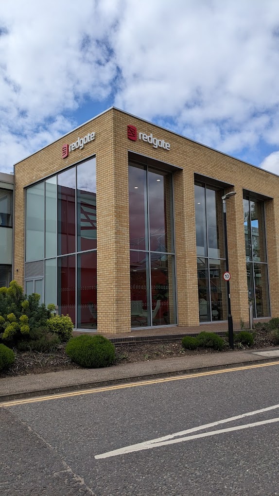
When Redgate Software moved into its new Cambridge headquarters at Cavendish House, I led the experience and brand design for the space — designing how everyone from a delivery driver to a long-serving employee would encounter, navigate, and feel at home in the building. Working alongside a professional interiors firm, I was responsible for everything visual in the space — from exterior building signage down to the smallest interior detail — ensuring the new office felt unmistakably Redgate from the moment you walked in.
Targets
The project had five clear goals: to create a space that was genuinely inclusive and accessible; to maintain continuity with the old office so long-serving employees felt at home; to apply the Redgate brand consistently across every touchpoint; to achieve an overall cohesion between the physical environment, the brand, and the people using the space every day; and to produce designs and templates flexible enough to be rolled out across other Redgate locations worldwide.
The approach
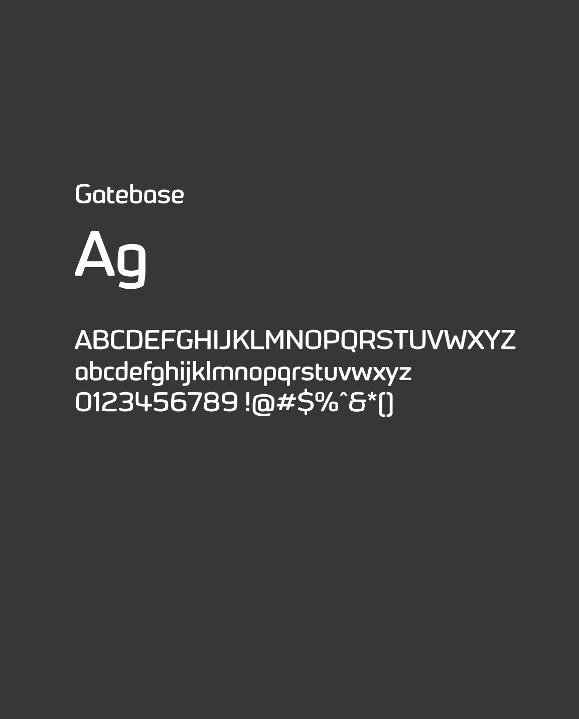
The project began with an audit of the old office, identifying what worked, what people were attached to, and what was worth carrying across, as well as researching specific user needs and journeys. From there, the creative approach was rooted in the Redgate typeface and brand fundamentals. Rather than building a separate icon language from scratch, I derived shapes, curves and angles directly from the letterforms and core brand elements, giving the environmental design the same DNA as the brand itself. A comma became a toilet flush handle. The curves within the letterforms became the basis for other shapes and symbols throughout the space. The database shape at the heart of the Redgate logo became a recurring motif used across the building. The work spanned every touchpoint a person meets in the building, treated as a single connected experience
Creations
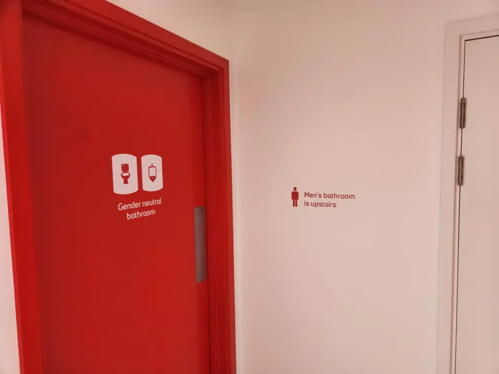
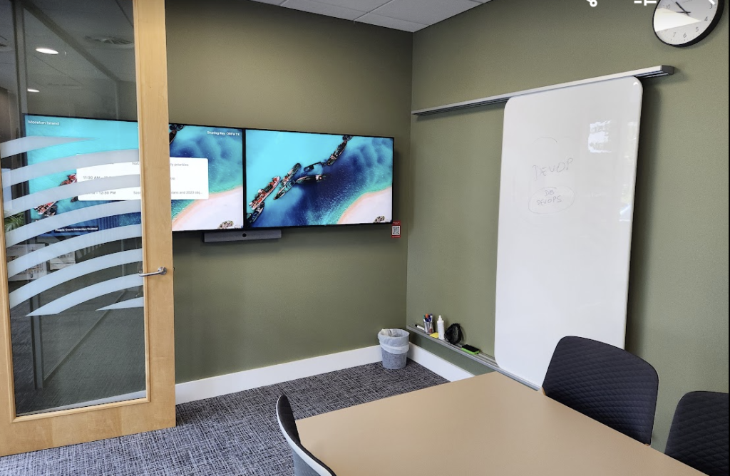
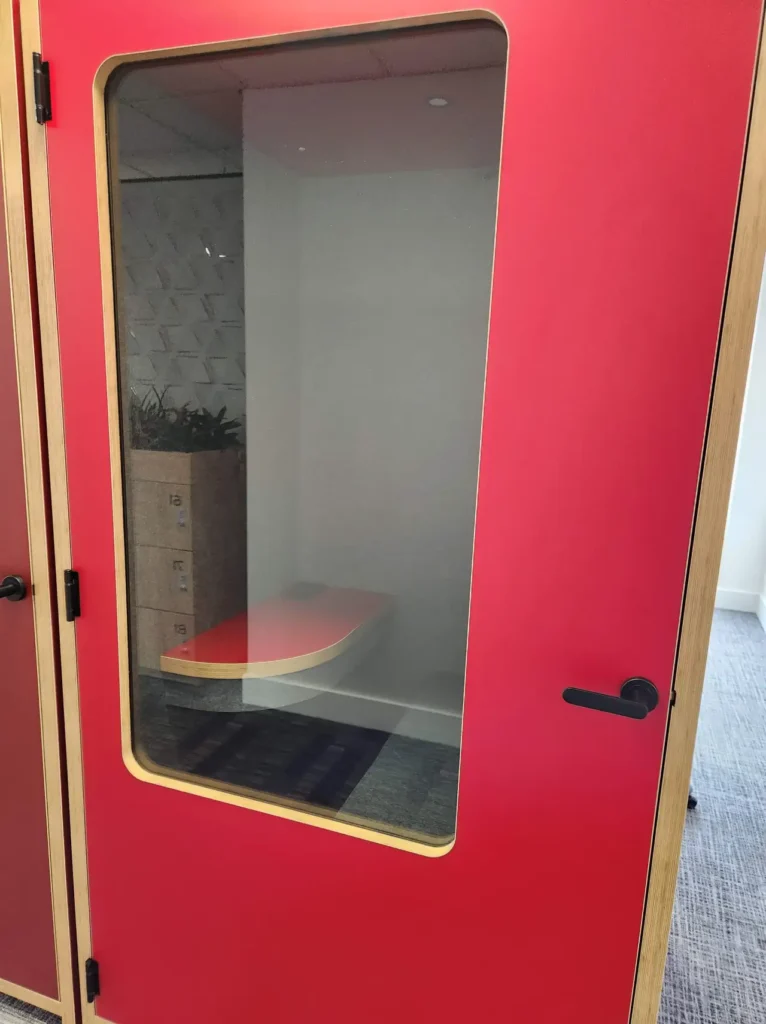
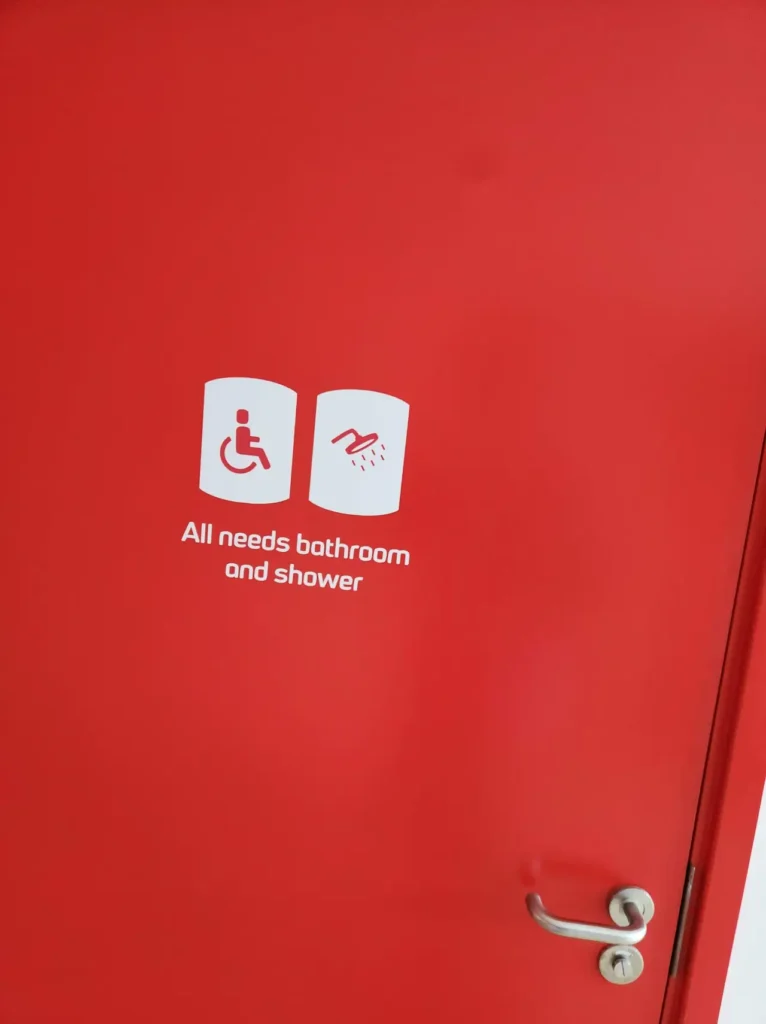
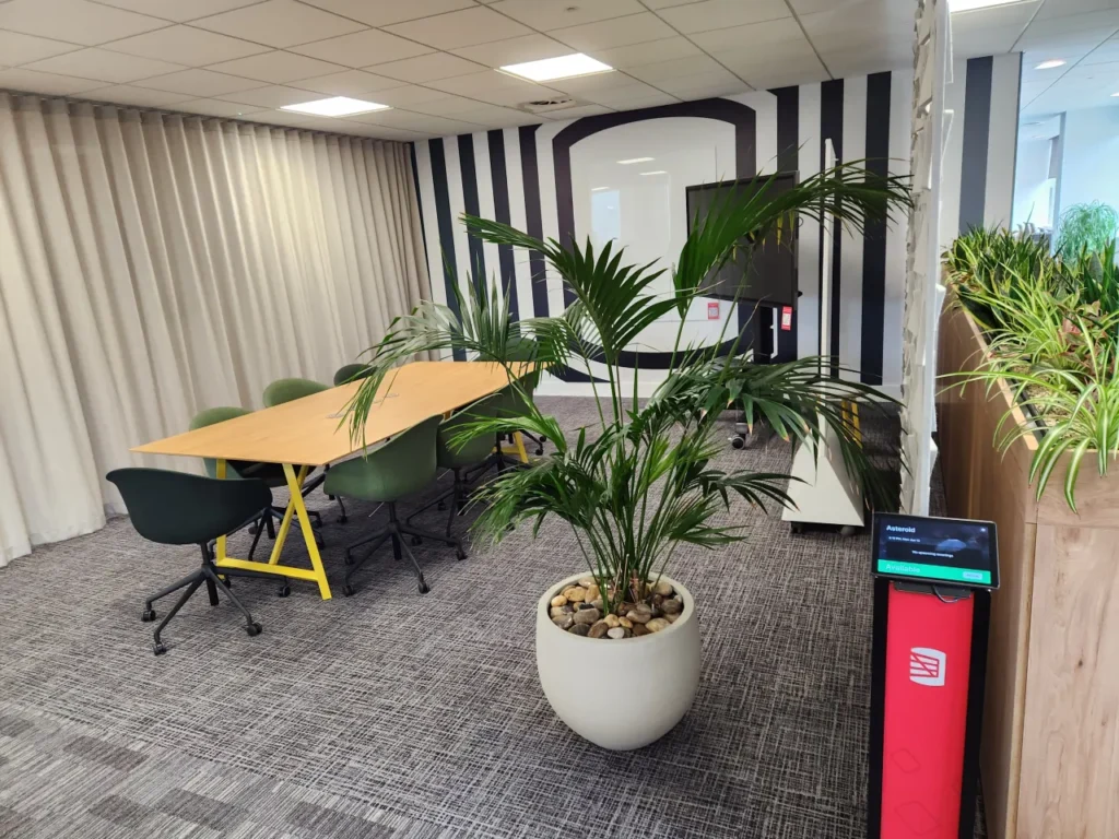
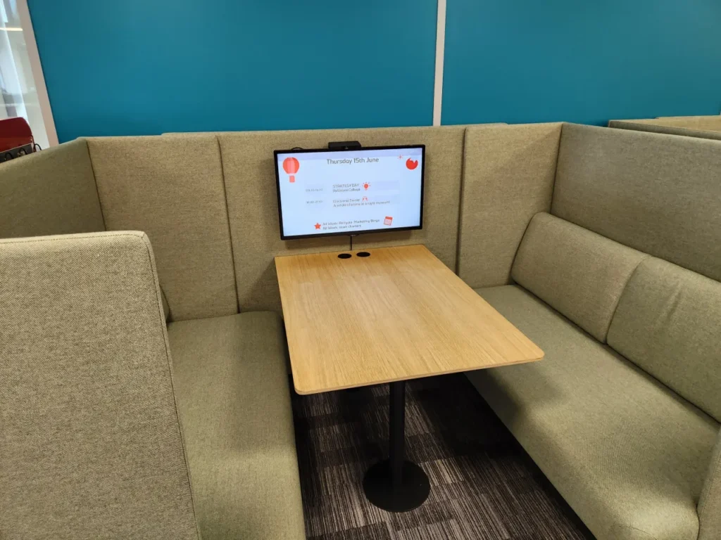
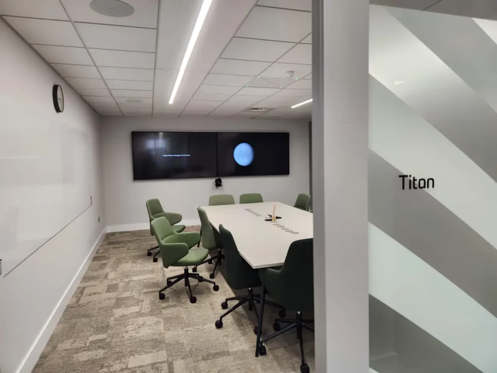
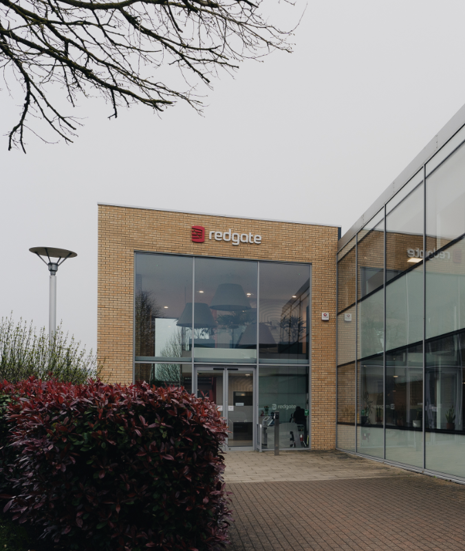
The work covered the entire space: exterior building signage including size, placement, colourway and supplier liaison; room naming and wayfinding; info and warning signs; genderless toilet signage; inclusive iconography for accessible bathrooms and shower rooms; window stickers; a branded photo wall; and a Polaroid camera installation so employees could add themselves to the space and stay present in a hybrid workplace.
Room treatments were varied by purpose, with thicker, more private designs for the boardroom and wellbeing room, and lighter applications in open collaborative areas. I also created a suite of templates for the building management team so the space could stay on-brand long in to the future.
As a wheelchair user myself, I brought lived experience of what inclusive design can contribute; not a compliance checkbox added at the end, but a consideration built into how every touchpoint was planned, and how those can benefit everyone. That meant thinking carefully about who moves through the building and how: step-free routes that didn’t feel like afterthoughts, accessible bathroom and shower facilities signed as “all needs”. The diverse team also contributed language for genderless signage so nobody had to navigate an assumption about who they were before they’d even found the room. The goal throughout was a building where accessibility felt stylish and intuitive for everyone, rather than a separate provision for some.
By the end of the project, there wasn’t a room in the building that didn’t have something I’d contributed to. That’s something I’m genuinely proud of.
Related Projects
Other major projects during my time at Redgate are outlined on the Simple Talk and Brand building at Redgate portfolio entries.
Thanks to Steve Jones for many of these photos. Check out his review, here: voiceofthedba.com/2023/06/14/the-new-redgate-office-in-cambridge/