Honeycomb UX Framework
-
In 10 words
Co-authoring the UX foundations for a global SaaS web presence.
-
Services
UX Framework. Design System. Figma. Component Architecture. Accessibility.
-
Visit
About the project
Co-authoring the UX framework behind a scalable, multi-brand web presence
Overview
Honeycomb was Redgate’s long-term project to unify the design and development pipeline across their entire web presence. Over years of growth, the system had become increasingly fragmented, with duplicated components, and multiple repositories, and a lack of visibility across non-brand teams, meaning every project carried unnecessary overhead before a single design decision was made. I was one of two designers on the core team, working alongside a team of developers, contributing to the framework from early discovery through to the core system being completed.
Targets
The project had five clear goals: unify the Redgate UX framework across a fragmented web estate; establish a 1:1 design-to-development pipeline via Figma and Storybook; build a system scalable across multiple sub-brands and content teams; achieve full WCAG 2.1 compliance across all components and variants; and lay the groundwork for a self-service content model that would reduce reliance on designers and developers for every piece of marketing output. A key consideration throughout was that the system needed to work not just for the design team, but for developers, marketers, and content teams across the business.
Discovery and Strategy
Discovery started with a thorough audit of the existing Redgate web estate, running alongside regular check-ins with the development team who were evaluating tooling in parallel. The decision to build on Untitled UI as a Figma foundation was deliberate and technically grounded, with the overhauled Redgate estate being Tailwind-based, using a well-structured base kit meant effort could be focused on building a more targeted set of brand-specific primitives. Time savings such as this allowed us to retain some capacity for other projects, at what was a busy period for the Brand team.
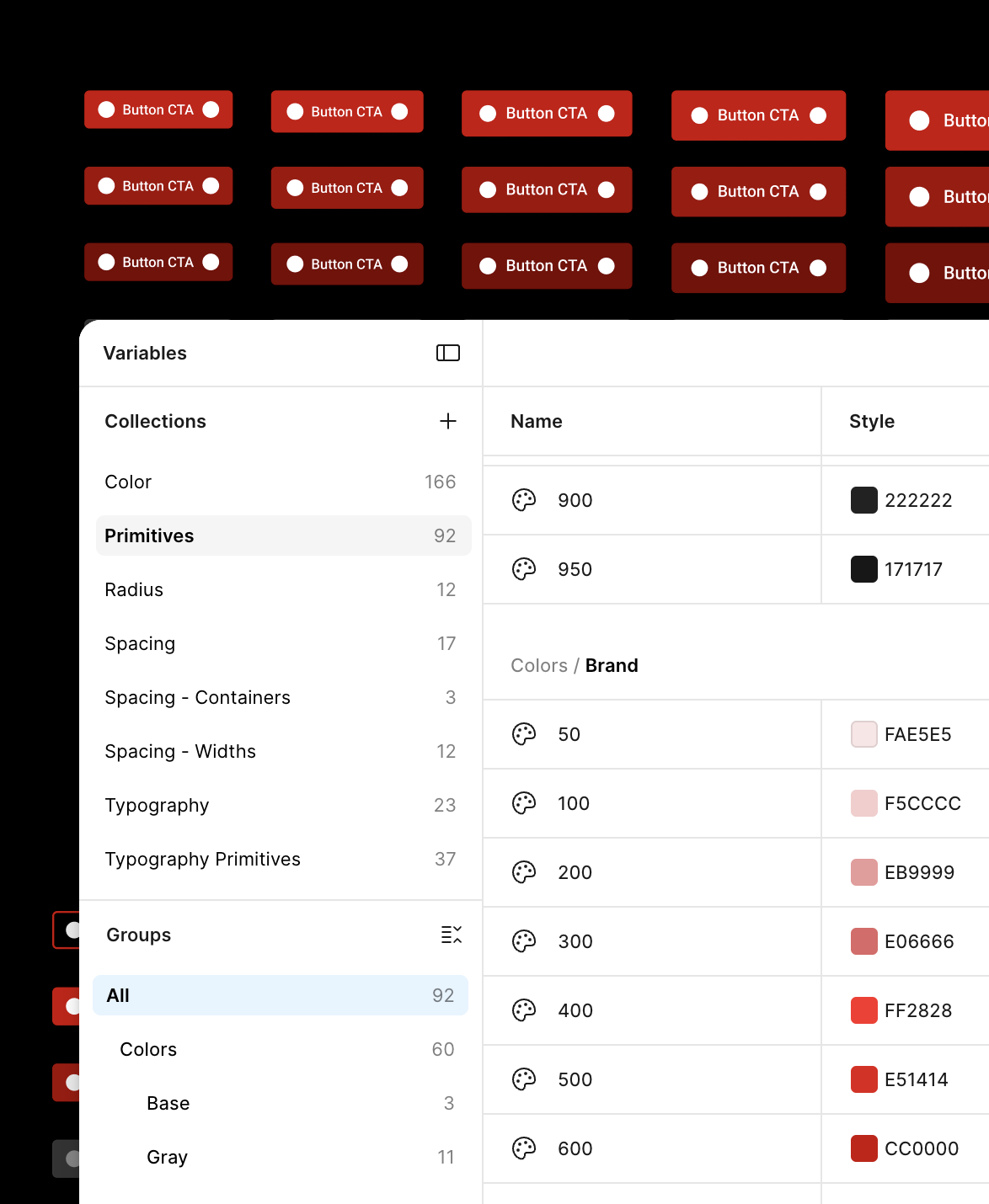
A key decision made early was establishing a semantic convention, shared between both design and development sides. This helped to streamline communication, and protect against duplication.
 1
1
Build & Pipeline
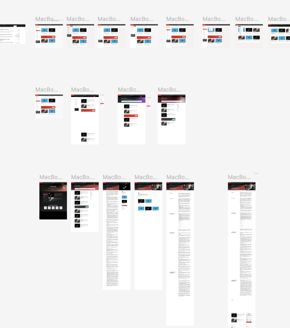
The system was extensively personalised from the Untitled UI base — components replaced, extended, and rebuilt to carry Redgate’s own brand DNA fully. The variable architecture covered the full scope of the product family: separate modes for each sub-brand (Redgate, Simple Talk, PASS), colour modes within each, as well as light and dark variants, and size scales to meet accessibility requirements throughout. WCAG 2.1 compliance was designed in from the start, and the system was built to be responsive across all devices.
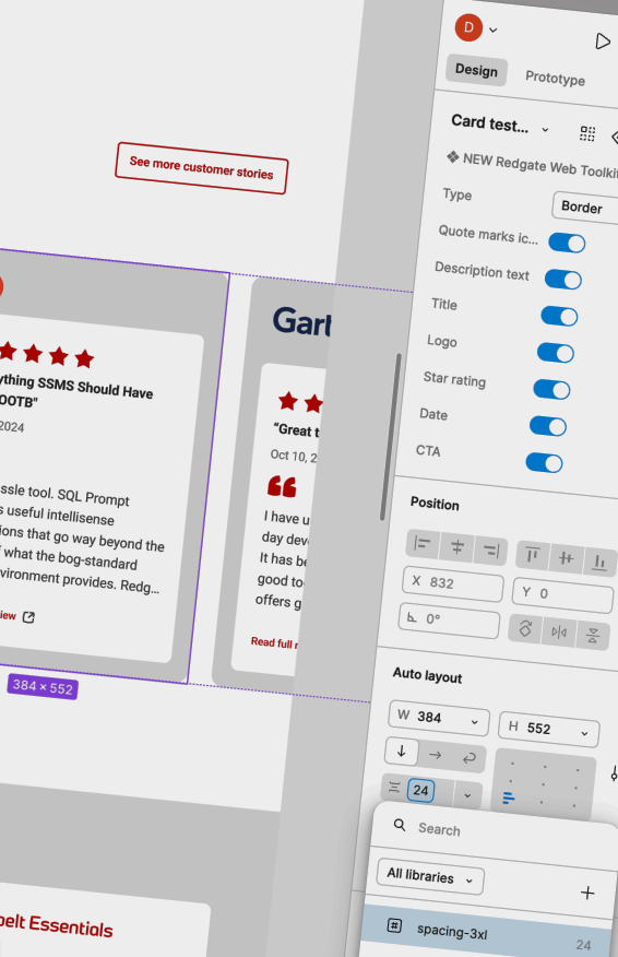
The developer-facing half of the pipeline ran through Storybook, providing a documented, live component reference that maintained a 1:1 likeness with the Figma system and kept design and production in sync, rather than approximately aligned.
The design and development process was also structured to facilitate a custom WordPress block-builder. This would allow product marketing teams to assemble and submit content independently, with the brand team reviewing finalised output rather than being involved at every stage of creation.
The shift from full design and development required for every piece of content, to a governed self-service model, was something I had a hand in advocating for, and it’s the kind of operational thinking the framework was always pointed towards, and helps to free-up time for the brand team to focus on the brand itself, rather than purely on delivery.